Wine Enthusiast magazine wine ratings distribution across US red wine vintages
I thought it would be interesting to plot some data using box plots and then to plot the same data again using a tile grid. Box plots are great to get a quick visual overview of some standard statistical properties of the data. A tile grid (also, sometimes referred to as a heatmap) can be used to tell a similar story, while adding some further granular detail. Using the wine dataset I used previously in other posts, I select the main red wine varieties produced in the US for this analysis.
Firstly, I load the libraries required for this post.
# Load libraries required for this post
library(tidyverse)
Next, I get the data from the ‘Tidy Tuesday’ Github repo. For more about the Tidy Tuesday project, see this post.
# Get the base data from the Tidy Tuesday Github repository using readr package
# 14 variables with 129,971 observations
wine_ratings <- read_csv("https://raw.githubusercontent.com/rfordatascience/tidytuesday/master/data/2019/2019-05-28/winemag-data-130k-v2.csv")
This dataset contains nearly 130k wines that have been rated by Wine Enthusiast magazine. The ratings range from 80 points to 100 points. Each row corresponds to a wine that has been rated and contains the rating, along with information about the wine.
The vintage of the wine is not available as a variable in the dataset. However, the wine vintage is mentioned in the title of most of the wines, so I can create a new variable (‘year’) by extracting it from the title. I use ‘extract()’ from the magrittr package to do this. I also trim the dataset to include only things I need for this US red wine analysis.
# Extract the vintage year from the title of the wine
# Filter the data to remove variables and observations I don't need
wr_year_red <- wine_ratings %>%
  extract(title, "year", "(19\\d\\d|20\\d\\d)",
    convert = TRUE, remove = FALSE
  ) %>% # extract the vintage from the wine label
  filter(!is.na(year)) %>% # removes 4,626 observations
  filter(!year %in% c(1912, 1929)) %>% # these appear erronously and only affect 14 rows
  select(country, points, price, year, variety) %>%
  filter(country == "US") %>% # US wines only
  filter(variety %in% c(
    "Pinot Noir", "Cabernet Sauvignon", "Syrah",
    "Red Blend", "Zinfandel", "Merlot"
  )) %>% # popular reds
  select(points, variety, year) %>%
  filter(year > 2004 & year < 2016) %>% # years with more than 1,000 wines
  mutate(year = factor(year)) %>%
  remove_missing() # remove rows with NAs (113 rows)
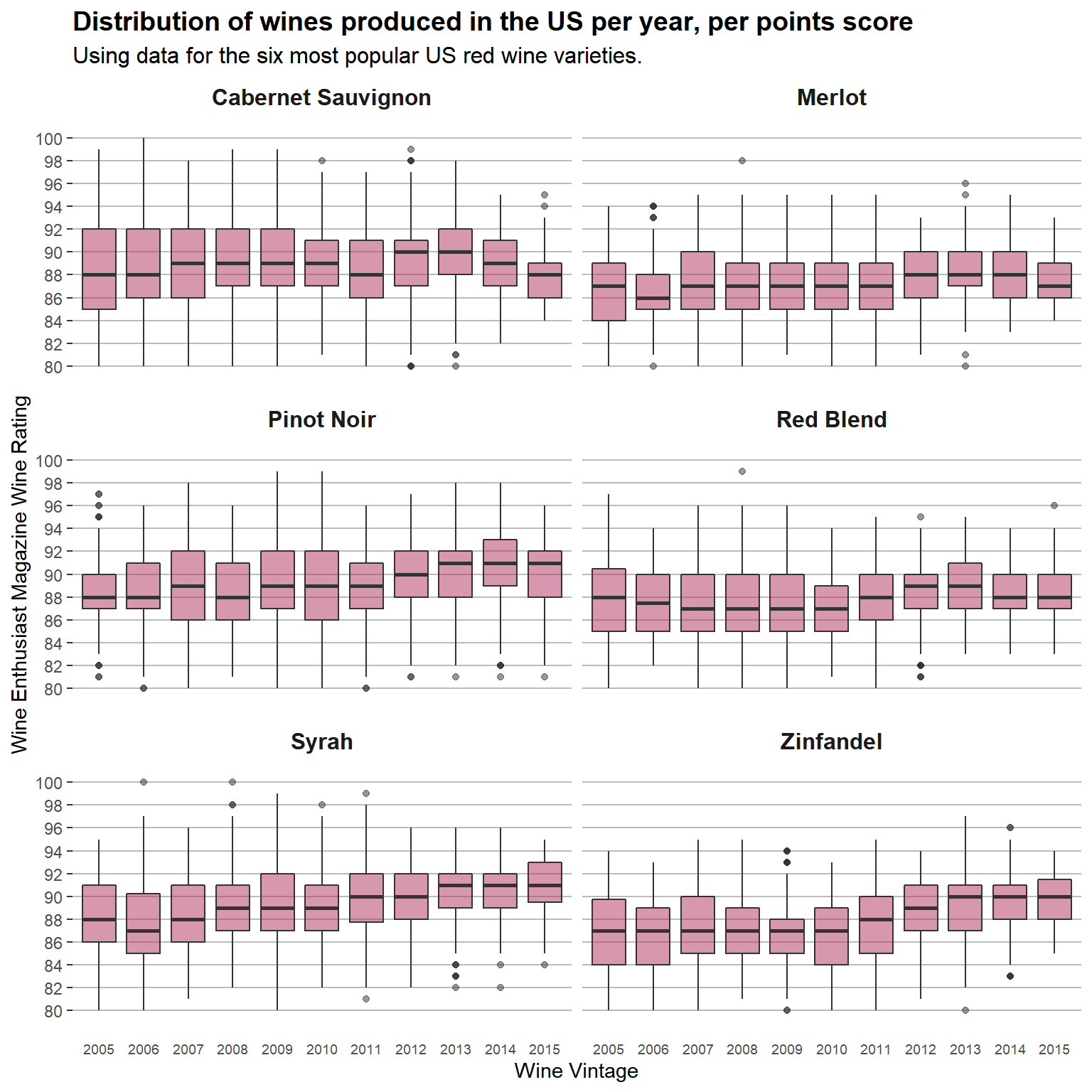
Using the cleaned up dataset I create plots to display wine rating changes from 2005 to 2015. I use box plots to do this, as I feel they are a good fit for what I want to see here. The data only contains US wine and I break out the plots into six charts, one for each of the main six red wine vintages.
# create the boxplot chart by year and points
# break out by read wine vintage
wr_year_red %>%
  ggplot(aes(year, points)) +
  geom_boxplot(fill = "maroon", alpha = 0.5, show.legend = FALSE) +
  facet_wrap(~variety, ncol = 2) +
  scale_y_continuous(
    breaks = c(
      80, 82, 84, 86, 88, 90,
      92, 94, 96, 98, 100
    ),
    limits = c(78, 102),
    expand = c(0, 0)
  ) +
  labs(
    title = "Distribution of wines produced in the US per year, per points score",
    subtitle = "Using data for the six most popular US red wine varieties.",
    x = "Wine Vintage", y = "Wine Enthusiast Magazine Wine Rating"
  ) +
  theme(
    panel.background = element_blank(), # element_rect(fill = "gray90"),
    plot.title = element_text(colour = "black", hjust = 0, size = 14, face = "bold"),
    plot.subtitle = element_text(colour = "black", hjust = 0, size = 12),
    axis.ticks.x = element_blank(),
    panel.grid.major.x = element_blank(),
    panel.grid.minor.x = element_blank(),
    panel.grid.major.y = element_line(color = "#BBBBBB"),
    panel.grid.minor.y = element_blank(),
    axis.text.x = element_text(size = 7),
    strip.background = element_rect(fill = "white"), # title area of sub charts
    strip.text = element_text(size = 12, face = "bold")
  )
The box plots show a standardized way of showing the data by displaying the minimum, maximum, median, first and third quartiles for each year, across the six red wine varieties. This makes it straightforward to make comparisons by look at the charts. For Cabernet Sauvignon, the median rating is 88 points for both 2005 and 2015, but the range of quality is much narrower for 2015. The Zinfindel variety doesn’t have many wines that are highly rated, but the quality steadily improves, with the first quartile in 2015 (88 points) greater than the median in 2005 (87 points). Likewise Syrah shows steady improvement during the time period.
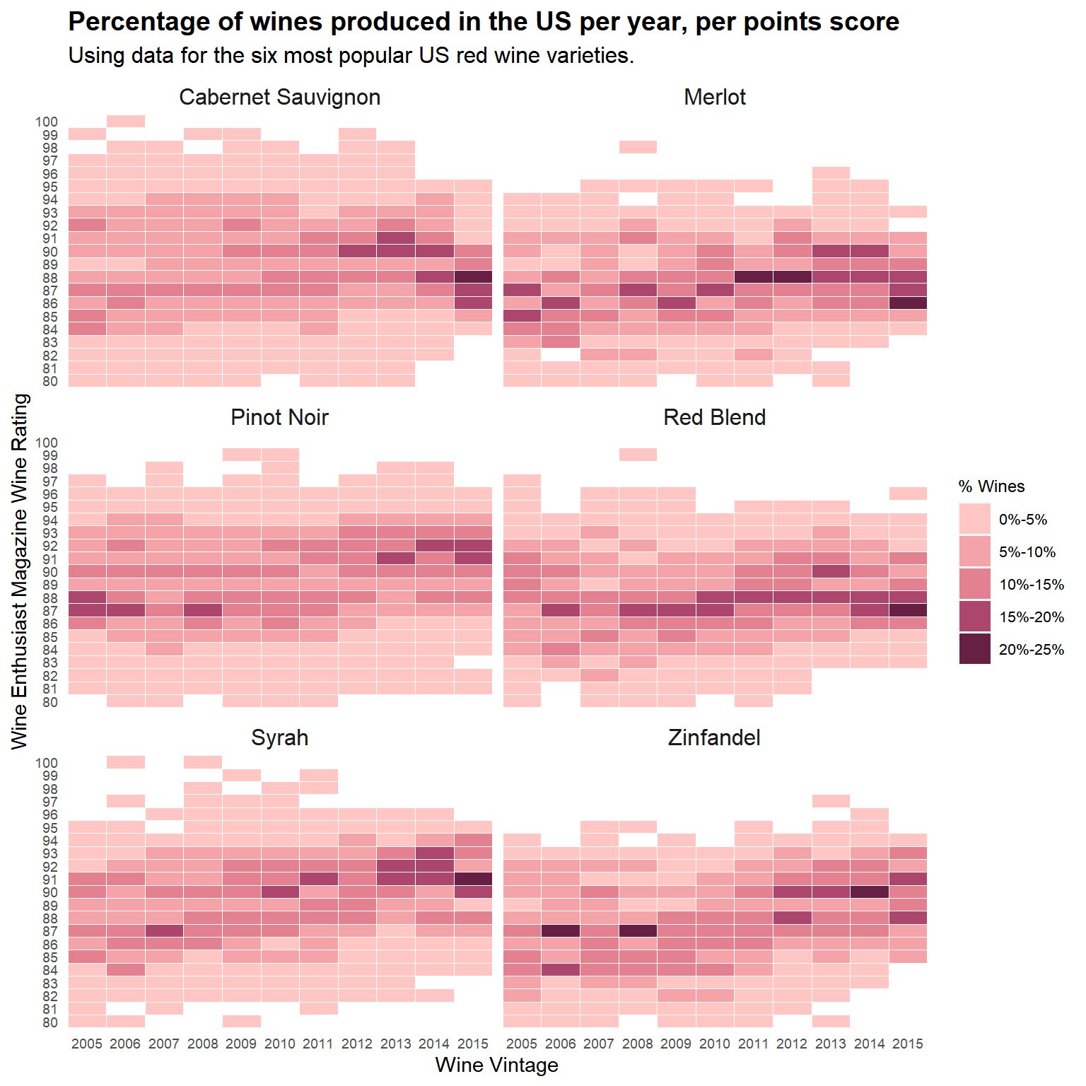
Another way to look at this data is to use tilegrid plots. In order to do this I need to make some enhancements to the dataset. Specifically, I get a count of the wines when the data is grouped by variety and year. Then I get a count of the wines when the data is grouped by variety, year and points. This allows me to calculate the percentage of wines for a given points level, per variety and vintage year. Therefore, the sum of the percentages across all the ratings for a specific variety and year is 100%. The last thing to do is to assign bins to group the data. I settle on five bins starting with 0%-5% and ending with 20%-25%. Five is enough to capture relevant detail, yet still make the chart easy to read.
# Create data tibble for the tile grid chart extending wr_year_red created previously
# Percentage of wines per points level for each year for the six main red varieties
heat_tib <- wr_year_red %>%
  group_by(variety, year) %>%
  add_count(year, name = "year_tots") %>% # count of wines, by variety and year
  ungroup() %>%
  group_by(variety, year, points) %>%
  add_count(name = "num_wines") %>% # count of wines, by variety, year and points
  arrange(variety, year, points) %>% # order by variety, year and points
  distinct() %>% # keep only the unique rows
  mutate(num_perc = (num_wines / year_tots)) %>% # % of wines with a given points level
  # per variety and year
  mutate(points = factor(points, levels = (wr_year_red %>%
    select(points) %>%
    distinct() %>%
    arrange(points) %>%
    mutate(points = factor(points)) %>%
    pull(points)))) %>% # order points levels chronologically
  mutate(
    num_cat = case_when( # assign 'num_perc' across 5 bin categories
      num_perc < 0.05 ~ "0%-5%",
      num_perc >= 0.05 & num_perc < 0.10 ~ "5%-10%",
      num_perc >= 0.10 & num_perc < 0.15 ~ "10%-15%",
      num_perc >= 0.15 & num_perc < 0.20 ~ "15%-20%",
      num_perc >= 0.20 & num_perc < 0.25 ~ "20%-25%"
    ),
    num_cat = factor(num_cat, levels = c(
      "0%-5%", "5%-10%", "10%-15%",
      "15%-20%", "20%-25%"
    ))
  )
Now that the data is ready I can create the tilegrid chart. For the color palette I pick a range of colors from light to dark in the same shade. Naturally, the shade I use is based on the red wine color.
# Colour palette for the 5 bin categories
fillCol3 <- c("#ffc6c4", "#f4a3a8", "#e38191", "#ad466c", "#672044")

# Create a tile grid plot by year and points (ratings)
ggplot(heat_tib, aes(x = year, y = points, fill = num_cat)) +
  geom_tile(colour = "white", size = 0.2) +
  facet_wrap(~variety, ncol = 2) +
  scale_fill_manual(values = fillCol3, na.value = "grey90") +
  scale_x_discrete(expand = c(0, 0)) + # remove any padding
  scale_y_discrete(expand = c(0, 0)) + # remove any padding
  labs(
    title = "Percentage of wines produced in the US per year, per points score",
    subtitle = "Using data for the six most popular US red wine varieties.",
    x = "Wine Vintage", y = "Wine Enthusiast Magazine Wine Rating", fill = "% Wines"
  ) +
  theme(
    panel.background = element_rect(fill = "white"),
    plot.title = element_text(colour = "black", hjust = 0, size = 14, face = "bold"),
    plot.subtitle = element_text(colour = "black", hjust = 0, size = 12),
    axis.ticks = element_blank(),
    axis.text.x = element_text(size = 7),
    axis.text.y = element_text(size = 7),
    legend.title = element_text(size = 9),
    legend.text = element_text(size = 8),
    strip.background = element_rect(fill = "white"),
    strip.text = element_text(size = 12)
  )
For the Cabernet Sauvignon variety, the change in rating concentration can again be seen very clearly, with no more than 15% of the wines associated with any rating prior to 2012. Interestingly, for Pinot Noir, wines that were rated as outliers on the high end in 2005 in the boxplot chart above, are no longer outliers in subsequent years due to the upward movement of the majority of the ratings. The tilegrid chart demonstrates this very nicely. The upward pattern of the Syrah and Zinfandel varieties is also very clear.
The box plot does a nice job of making it easy to compare patterns quickly and clearly. While, the tilegrid adds some nuance and richer information about specific rating levels.