Create a model to predict wine color from the wine rating description
I recently read an interesting blog post by Julia Silge about creating a supervised machine learning classification model to distinguish text between two different novels. I thought it would be good exercise to create a similar model using the wine dataset I previously used in other blog posts. Specifically, a model that classifies each wine into either red or white wine, based on the text used to describe the wine by the wine taster.
Firstly, I load the libraries I need for this post.
# Load libraries required for this post
library(tidyverse)
library(tidytext) # https://www.tidytextmining.com/
library(rsample) # https://rsample.tidymodels.org/
library(glmnet) # https://glmnet.stanford.edu/articles/glmnet.html
library(broom) # https://broom.tidymodels.org/
library(yardstick) # https://yardstick.tidymodels.org/
library(scales)
library(gt)
1. Construct the dataset
Next, I get the data from the ‘Tidy Tuesday’ Github repo. For more about the Tidy Tuesday project, see this post.
# Get the base data from the Tidy Tuesday Github repository using readr package
# 14 variables with 129,971 observations
wine_ratings <- read_csv("https://raw.githubusercontent.com/rfordatascience/tidytuesday/master/data/2019/2019-05-28/winemag-data-130k-v2.csv")
This dataset contains nearly 130k wines that have been rated by Wine Enthusiast magazine. Each rating comes with a corresponding description of the wine submitted by the taster. These descriptions are short, generally about 3 sentences long. The color of the wine is not included in the dataset. I have to create this variable based on the variety of the wine. This is a pretty blunt way of assessing the color of the wine. Even though I’m sure there are some errors (especially when it comes to Champagne and Sparkling Blends), for the purposes of this post, they do not cause too many problems. Also, they provide some interesting insight when I run the model on the test dataset later on.
# Filter the data to keep only grapes with more than 1000 reviews
# Assign a wine color to each of those grapes
grape_color <- wine_ratings %>%
  count(variety) %>%
  arrange(desc(n)) %>%
  filter(n > 1000) %>%
  mutate(wine_color = case_when(
    variety == "Pinot Noir" ~ "Red",
    variety == "Chardonnay" ~ "White",
    variety == "Cabernet Sauvignon" ~ "Red",
    variety == "Red Blend" ~ "Red",
    variety == "Bordeaux-style Red Blend" ~ "Red",
    variety == "Riesling" ~ "White",
    variety == "Sauvignon Blanc" ~ "White",
    variety == "Syrah" ~ "Red",
    variety == "Merlot" ~ "Red",
    variety == "Nebbiolo" ~ "Red",
    variety == "Zinfandel" ~ "Red",
    variety == "Sangiovese" ~ "Red",
    variety == "Malbec" ~ "Red",
    variety == "Portuguese Red" ~ "Red",
    variety == "White Blend" ~ "White",
    variety == "Sparkling Blend" ~ "White",
    variety == "Tempranillo" ~ "Red",
    variety == "Rhône-style Red Blend" ~ "Red",
    variety == "Pinot Gris" ~ "White",
    variety == "Champagne Blend" ~ "White",
    variety == "Cabernet Franc" ~ "Red",
    variety == "Grüner Veltliner" ~ "White",
    variety == "Portuguese White" ~ "White",
    variety == "Bordeaux-style White Blend" ~ "White",
    variety == "Pinot Grigio" ~ "White",
    variety == "Gamay" ~ "Red",
    variety == "Gewürztraminer" ~ "White"
  )) %>%
  remove_missing() # remove rows with NAs (1 row - Rose)
Next, I join this wine color variable to the original dataset, keeping only the variables I need. This leaves me with the wine color, the taster’s description of the wine and a corresponding ID variable, as a base dataset with about 100k rows to use for the model. Addtionally, I create a second version of this dataset that also includes the variety of the wine. This is not used in the construction of the model, but it is useful later on when I examine the incorrectly classified wines.
# Create the base data set for the model by joining the wine color to the dataset
# Add an ID column and remove all other colunms except description and wine_color
# This results in 99,758 rows; desc_ID, description & wine_color
base_model_data <- wine_ratings %>%
  inner_join(grape_color) %>%
  select(description, wine_color) %>%
  rowid_to_column("desc_ID") # could also use 'mutate(desc_ID = row_number())'

# Create a version of the base data set for the model that contains the variety
base_model_data_variety <- wine_ratings %>%
  inner_join(grape_color) %>%
  select(description, wine_color, variety) %>%
  rowid_to_column("desc_ID") # could also use 'mutate(desc_ID = row_number())'
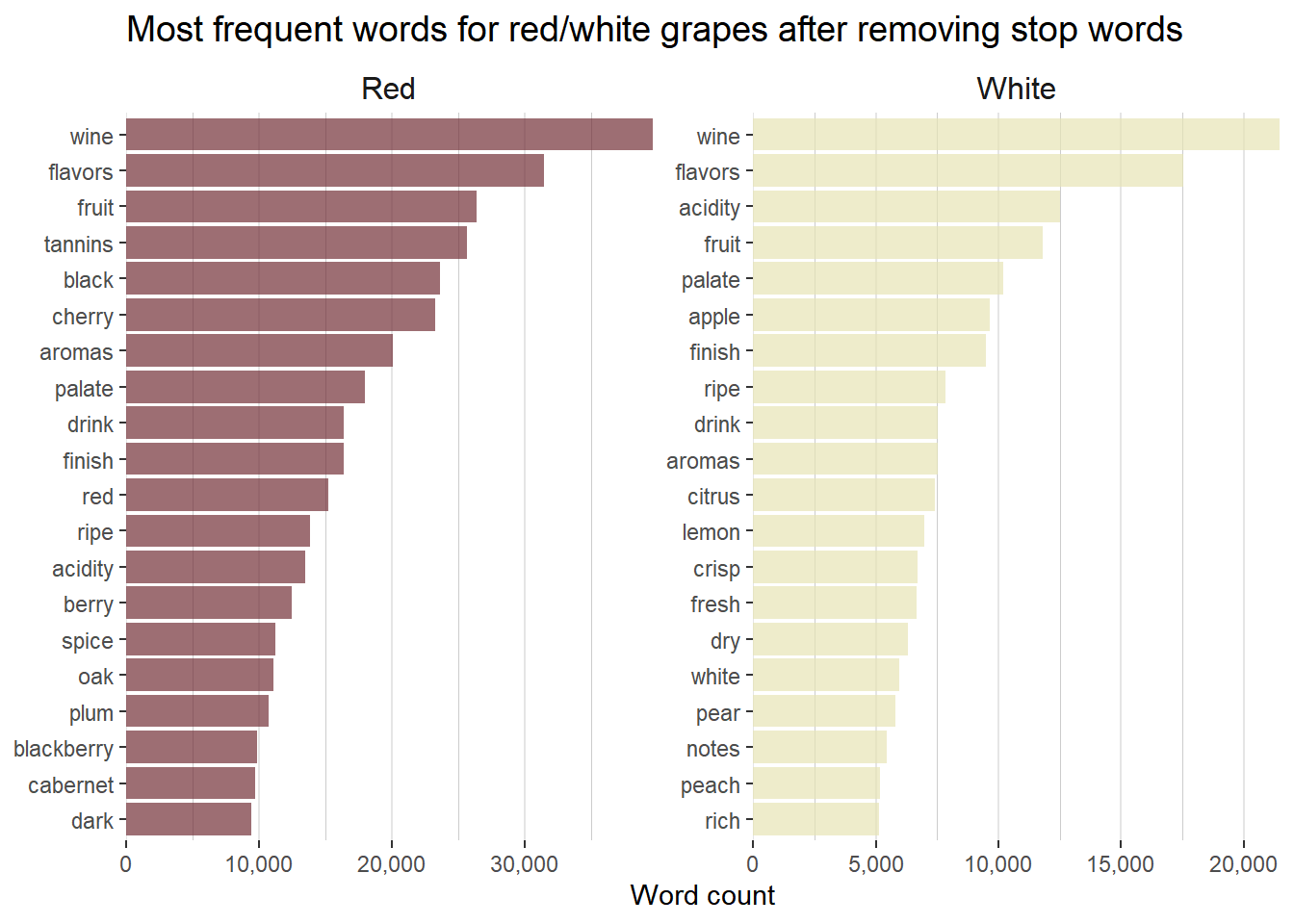
The next step is to unnest the words in the description into individual rows. I do this using functions from the tidytext package. This structure is referred to as a tidy text format, that is, a table with one token (word in this case) per row. Having the text data in this format makes it easy to use with packages in the tidyverse.
# Using tidytext unnest the words in the description into individual rows
# Only keep the rows with words that occur more than 100 times
tidy_wine_color <- base_model_data %>%
  unnest_tokens(word, description) %>%
  anti_join(get_stopwords()) %>% # remove stop words
  group_by(word) %>%
  filter(n() > 100) %>% # keep words that appear more than 100 times
  ungroup()

# Create a bar plot of the top 20 words associated with each wine color
tidy_wine_color %>%
  count(wine_color, word, sort = TRUE) %>%
  group_by(wine_color) %>%
  top_n(20) %>%
  ungroup() %>%
  ggplot(aes(reorder_within(word, n, wine_color), n,
    fill = wine_color
  )) +
  geom_col(alpha = 0.7, show.legend = FALSE) +
  scale_x_reordered() +
  scale_y_continuous(expand = c(0, 0), labels = comma) +
  scale_fill_manual(values = c("#722F37", "#e6e4b5")) +
  facet_wrap(~wine_color, scales = "free") +
  coord_flip() +
  labs(
    x = NULL, y = "Word count",
    title = "Most frequent words for red/white grapes after removing stop words",
  ) +
  theme(
    panel.background = element_blank(),
    plot.title = element_text(color = "black", hjust = 0, size = 14),
    panel.grid.major.x = element_line(color = "grey90"),
    panel.grid.minor.x = element_line(color = "grey80"),
    panel.grid.major.y = element_blank(),
    panel.grid.minor.y = element_blank(),
    strip.background = element_rect(fill = "white"), # title area of sub charts
    strip.text = element_text(size = 12)
  )
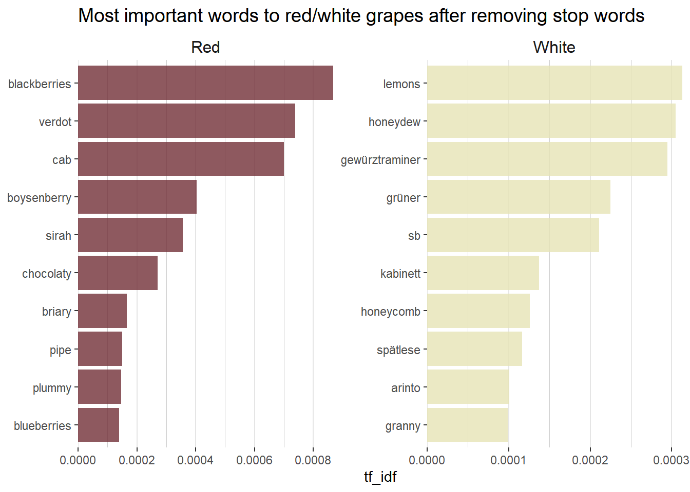
Another common piece of exploritory data analysis when working with text data is to calculate the tf-idf statistic. The term frequency (tf) part is simply the count of a given word divided by the total number of words in the dataset. The inverse document frequency (idf) is a weight that the term frequency is multiplied by. The idf weight is smaller for commonly used words and larger for words that are not used very much. The tf-idf statistic attempts to measure how important a given word is to a dataset.
# Create a plot using tf_idf instead of word count
# Get the total number of red and white wines in the dataset
total_words <- tidy_wine_color %>%
  count(wine_color, word, sort = TRUE) %>%
  group_by(wine_color) %>%
  summarize(total = sum(n))

# Create a new dataset by combining the main data with the totals for red and white
tidy_wine_color_idf <- tidy_wine_color %>%
  count(wine_color, word, sort = TRUE) %>%
  left_join(total_words)

# If all tdf_idfs are zero that means that every word appears in descriptions of both
# red and white wines
# Create a bar plot of the top 10 words associated with each color wine using tf_idf
tidy_wine_color_idf %>%
  bind_tf_idf(word, wine_color, n) %>%
  select(-total) %>%
  arrange(desc(tf_idf)) %>%
  group_by(wine_color) %>%
  top_n(10) %>%
  ungroup() %>%
  ggplot(aes(reorder_within(word, tf_idf, wine_color), tf_idf,
    fill = wine_color
  )) +
  geom_col(alpha = 0.8, show.legend = FALSE) +
  scale_x_reordered() +
  coord_flip() +
  facet_wrap(~wine_color, scales = "free") +
  scale_y_continuous(expand = c(0, 0), labels = number_format(accuracy = 0.0001)) +
  scale_fill_manual(values = c("#722F37", "#e6e4b5")) +
  labs(
    x = NULL, y = "tf_idf",
    title = "Most important words to red/white grapes after removing stop words"
  ) +
  theme(
    panel.background = element_blank(),
    plot.title = element_text(color = "black", hjust = 0, size = 14),
    panel.grid.major.x = element_line(color = "grey90"),
    panel.grid.minor.x = element_line(color = "grey80"),
    panel.grid.major.y = element_blank(),
    panel.grid.minor.y = element_blank(),
    strip.background = element_rect(fill = "white"), # title area of sub charts
    strip.text = element_text(size = 12)
  )
2. Build the model
Firstly, I need to split the data into training and test sets. I do this using the rsample package on the ‘base_model_data’ that I created earlier.
# Split the data into the training and test datasets (at the description level)
# Set a seed to ensure the data is identically split each run
set.seed(1916)
bm_data_split <- base_model_data %>%
  select(desc_ID) %>%
  initial_split()

# Break it into the training and test sets
train_data <- training(bm_data_split)
test_data <- testing(bm_data_split)
Now, I create a sparse matrix from the training data in order to use it with the model. A sparse matrix contains mostly elements that are zero, corresponding to few pairwise interactions.
# Transform the training data to a sparse matrix to use for the machine learning algorithm
sparse_words <- tidy_wine_color %>%
  count(desc_ID, word) %>%
  inner_join(train_data) %>%
  cast_sparse(desc_ID, word, n)
This results in a high dimensional training dataset with 74,818 observations (wine descriptions) and 2,391 features (unique individual words) with the intersection of these being a count of the number of times the given word appears in the given wine description. In most cases this intersection is blank, hence the sparse matrix.
The last step before creating the model is to use row names from the sparse matrix training data with the ‘base_model_data’ to create a tibble containing the 74,818 wine description IDs and the corresponding wine color.
# Build a tibble with a response variable
# That is, the wine_color that is associated with each desc_ID
word_rownames <- as.integer(rownames(sparse_words))

bm_data_joined <- tibble(desc_ID = word_rownames) %>%
  left_join(base_model_data %>%
    select(desc_ID, wine_color))
For the model, I fit a logistic regression model with LASSO regularization using the glmnet package.
Logistic regression models class probabilities. Any input to the model yields a number lying between 0 and 1, representing the probability of class membership, in this case the two classes are red wine and white wine.
In LASSO (Least Absolute Shrinkage and Selection Operator) regression, the effect of the penalty term is to set the the coefficients that contribute most to the error, to zero. This means that LASSO regression works like a feature selector that picks out the most important coefficients, i.e. those that are most predictive (and have the lowest p-values). It helps to reduce overfitting.
Lambda is a free parameter, which is usually selected in such a way that the resulting model minimises the out of sample error. The function cv.glmnet automatically performs a grid search to find the optimal value of lambda. This is the value of lambda that gives the simplest model, but also lies within one standard error of the optimal value of lambda.
I would recommend this tutorial as a useful introduction to logistic regression using LASSO.
# Train the classification model
is_red <- bm_data_joined$wine_color == "Red"
model <- cv.glmnet(sparse_words, is_red,
  family = "binomial",
  parallel = FALSE, keep = TRUE
)

# Default cross-validation curve plot from glmnet's output
plot(model)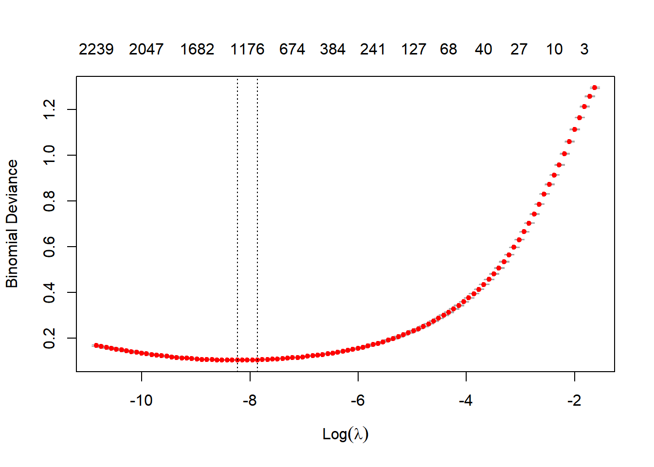
The plot shows that the log of the optimal value of lambda (i.e. the one that minimises the binomial deviance) is approximately -8.
# Default fit plot from glmnet's output
plot(model$glmnet.fit)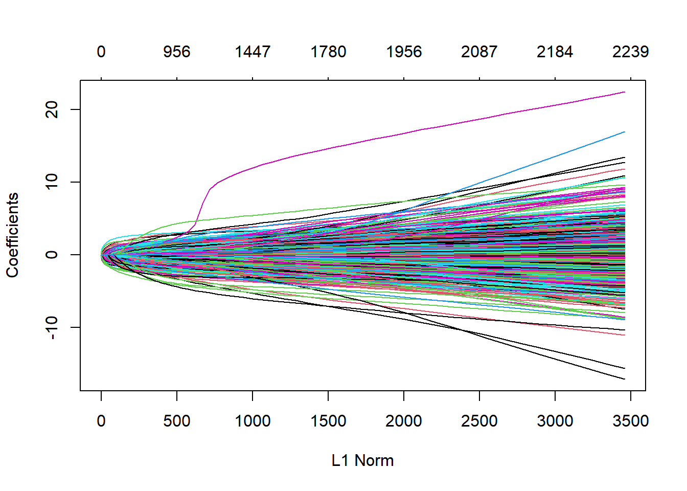
This is a coefficient profile plot of the coefficient paths for the fitted “glmnet” model. The smaller the L1 norm the more regularization is occuring. As the L1 norm increases, more variables enter the model, as their co-efficients take on non-zero values. The objective of regularisation is to balance accuracy and simplicity.
3. Examine and evaluate the model
Using the broom package to examine the coefficients of the model, for the largest value of lambda within one standard error of the minimum, we can see which coefficients are the largest in each direction.
# Get the coefficients of the model, for the largest value of lambda
# with error within 1 standard error of the minimum
coefs <- model$glmnet.fit %>%
  tidy() %>% # from the broom package; converts model output to tidy tibble
  filter(lambda == model$lambda.1se)

coefs %>%
  group_by(estimate > 0) %>%
  top_n(10, abs(estimate)) %>%
  ungroup() %>%
  ggplot(aes(estimate, fct_reorder(term, estimate), fill = estimate > 0)) +
  geom_col(alpha = 0.7, show.legend = FALSE) +
  scale_fill_manual(values = c("#e6e4b5", "#722F37")) +
  labs(
    y = NULL,
    title = "Coefficients that increase/decrease probability the most",
    subtitle = "A wine description mentioning 'lychee' is unlikely to be a red wine"
  ) +
  theme(
    panel.background = element_blank(),
    panel.grid.major.x = element_line(color = "grey90"),
    panel.grid.minor.x = element_line(color = "grey80"),
    panel.grid.major.y = element_line(color = "grey90"),
    panel.grid.minor.y = element_blank()
  )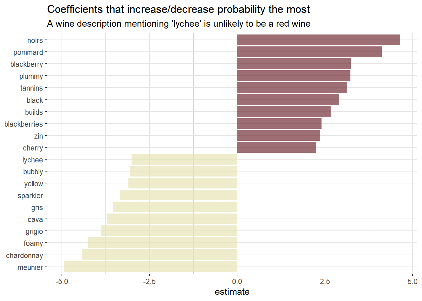
Looking at the plot above, the coefficients seem to make a lot of sense. Words like blackberry, plummy, black and cherry all strongly increase the probability of the wine being red. While coefficients like lychee, yellow, cava and chardonnay all decrease the probability of the wine being red.
Next thing is to evaluate the model using test data. I create a tibble that tells us for each wine description in the test set, the probability that it is describing a red wine.
# Extract the intercept
intercept <- coefs %>%
  filter(term == "(Intercept)") %>%
  pull(estimate)

# Create a tibble that tells us, for each desc_ID in the test set,
# the probability of it being a red wine
classifications <- tidy_wine_color %>%
  inner_join(test_data) %>%
  inner_join(coefs, by = c("word" = "term")) %>%
  group_by(desc_ID) %>%
  summarize(score = sum(estimate)) %>%
  mutate(probability = plogis(intercept + score))
Next, using the classifications tibble I just created, in conjunction with the yardstick package, I can calculate some model performance metrics. Starting with the receiver operating characteristic (ROC) curve. The ROC curve is created by plotting the true positive rate against the false positive rate at various threshold settings. It illustrates the diagnostic ability of our model on the test data.
# Use the yardstick package to calculate some model performance metrics
comment_classes <- classifications %>%
  left_join(base_model_data_variety %>%
    select(wine_color, desc_ID, variety), by = "desc_ID") %>%
  mutate(wine_color = as.factor(wine_color))

# Plot the ROC curve
comment_classes %>%
  roc_curve(wine_color, probability) %>%
  ggplot(aes(x = 1 - specificity, y = sensitivity)) +
  geom_line(color = "navy blue", size = 1.25) +
  geom_abline(lty = 2, alpha = 0.5, color = "gray75", size = 1) +
  labs(
    title = "ROC curve for text classification using regularized regression",
    subtitle = "Predicting whether a wine review description refers to a red wine or not"
  ) +
  theme(
    panel.background = element_blank(),
    panel.grid.major.x = element_line(color = "grey90"),
    panel.grid.minor.x = element_blank(),
    panel.grid.major.y = element_line(color = "grey90"),
    panel.grid.minor.y = element_blank()
  )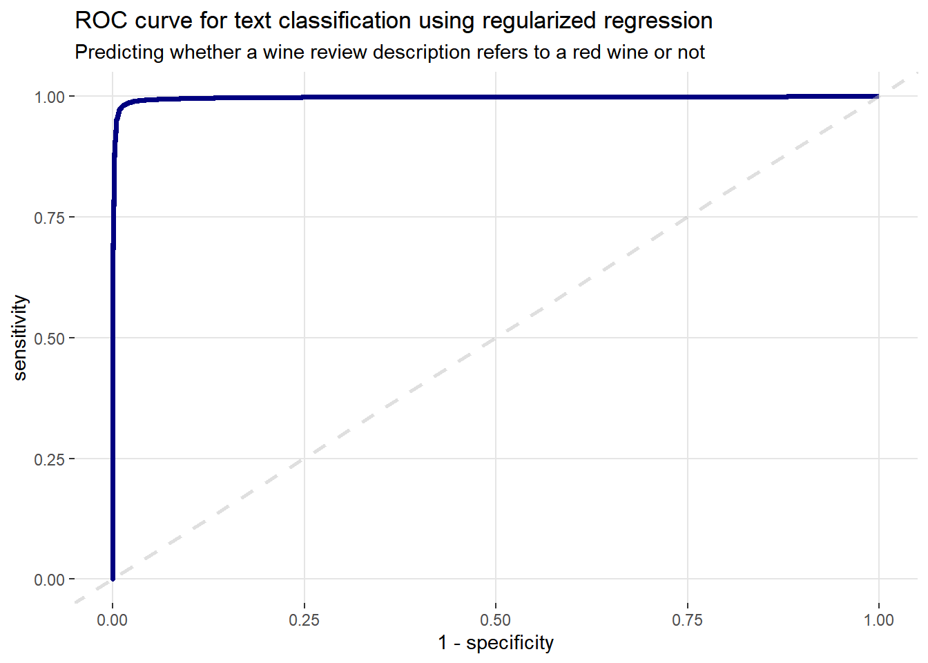
The x-axis (1-specificity) contains the false positive rate (false positive/(false positive + true negative)). The y-axis (sensitivity) contains the false negative rate (false negative/(true positive + false negative)). These points are then plotted for every possible threshold cut-off. A perfect model that predicts with 100% accuracy would have an ROC curve that passes through the upper left corner (100% specificity and 100% sensitivity). The dashed grey line represents the ‘line of no-discrimination’, which is where a model performance equivalent to random guessing would appear. Therefore, the plot above looks good, following the classic hockey stick shape.
Next obtain the area under the ROC curve (AUC) on the test data.
# Get the AUC on the test data
comment_classes %>%
  roc_auc(wine_color, probability)
## # A tibble: 1 x 3
## .metric .estimator .estimate
## <chr> <chr> <dbl>
## 1 roc_auc binary 0.997An AUC of 99.7% is a very good number. It corresponds to the probability that the model, when given one randomly selected positive instance and one randomly selected negative instance, will be able to tell which one is which.
It is also easy to create the confustion matrix. I use a probability of 0.5 as the cutoff. A confusion matrix is a table that helps the user to assess the performance of a classification algorithm.
# Create a confusion matrix
# I convert it to a tidy tibble, so I can extract the values
# I put them into a data frame to create a gt table
cm <- comment_classes %>%
  mutate(
    prediction = case_when(
      probability > 0.5 ~ "Red",
      TRUE ~ "White"
    ),
    prediction = as.factor(prediction)
  ) %>%
  conf_mat(wine_color, prediction) %>%
  tidy()

# Convert the output of the Confusion Matrix to a data frame
cm_df <- data.frame(
  True_Red = c(cm$value[1], cm$value[2]),
  True_White = c(cm$value[3], cm$value[4]),
  row.names = c("Pred_Red", "Pred_White")
)

# Create the table using the gt package
cm_df %>%
  gt(rownames_to_stub = TRUE) %>%
  data_color(columns = True_Red, colors = c("grey90", "#722F37")) %>%
  data_color(columns = True_White, colors = c("grey90", "#e6e4b5")) %>%
  fmt_number(
    columns = c(True_Red, True_White),
    sep_mark = ",",
    decimals = 0
  ) %>%
  tab_style(
    style = cell_text(weight = "bold"),
    locations = cells_column_labels()
  ) %>%
  tab_style(
    style = cell_text(weight = "bold"),
    locations = cells_stub()
  ) %>%
tab_options(table.align = "left")| True_Red | True_White | |
|---|---|---|
| Pred_Red | 15,989 | 203 |
| Pred_White | 201 | 8,547 |
The confusion matrix shows that the vast majority of predictions match the true wine color (i.e. true positives and true negatives). The are 203 false positives and 201 false negatives.
It is worth examining the descriptions of the wines that had a high probability of being red wines, but were actually white wines. These correspond to the 203 false positives from the confusion matrix.
# Examine the descriptions for wines with a high probability of being red grapes,
# but are actually white grapes
gt(comment_classes %>%
  filter(probability > .8, wine_color == "White") %>%
  slice(c(1, 5, 10, 15, 20)) %>%
  inner_join(base_model_data_variety %>%
    select(desc_ID, description, variety)) %>%
  select(probability, description, variety)) %>%
  tab_style(
    style = cell_text(weight = "bold"),
    locations = cells_column_labels()
)| probability | description | variety |
|---|---|---|
| 0.8772564 | A touch blossomy against a core of ripe raspberry and cherry perfume, the nose on this traditional-method Pinot Noir sparkler is particularly alluring. The palate is elegant and fresh, marked by fine, mouthfilling mousse and delicate raspberry-candy finish. | Sparkling Blend |
| 0.8318367 | 88—90 Barrel sample. Soft, open, the wood giving roundness to a spicy, rich wine. It will develop quickly. | Bordeaux-style White Blend |
| 0.9398980 | A fresh, strawberry-flavored wine, with good red berry and red apple-skin textures. The acidity is initially prominent, but then there is also a burst of candy, leaving softness. | Champagne Blend |
| 0.9663655 | This is a really fruity rosé that is full of red-berry fruits and bright acidity. Crisp on the palate with tart red-currant flavors, there's a tightness in acidity that could benefit with more integration. Let the bottle settle a few months before opening. | Champagne Blend |
| 0.9519207 | 93—95 Barrel sample. Domaine de Chevalier's white has a reputation for long aging, and that's the case with 2006. It is the structure that does it, very firm, almost tannic. But the fruit is also a star, ripe, dense, with green plum flavors and touches of spice. Give this at least 10 years. | Bordeaux-style White Blend |
The above table just displays 5 of the false positives, but they give a flavor for what is going on. The model predicts these to be red wines, but they match up with white wine varieties. The descriptions of the Sparkling and Champagne Blends imply that these are actually pink/rose blends and, therefore, the language contains words like ‘red-currant’, ‘raspberry’, ‘strawberry’ and ‘cherry’. And the description of the Bordeaux-style White Blend variety uses terms like ‘wood’, ‘spicy’, ‘dense’ and ‘plum’, which would not readily be associated with white wines.
On the flip side, the 201 false negatives correspond to the wine descriptions with a low probability of being red wines, but are actually red wine grapes.
# Examine the descriptions for wines with a low probability of being red grapes,
# but are actually red grapes
gt(comment_classes %>%
  filter(
    probability < .3,
    wine_color == "Red"
  ) %>%
  slice(c(1, 5, 10, 15, 20)) %>%
  inner_join(base_model_data_variety %>%
    select(desc_ID, description, variety)) %>%
  select(probability, description, variety)) %>%
  tab_style(
    style = cell_text(weight = "bold"),
    locations = cells_column_labels()
)| probability | description | variety |
|---|---|---|
| 0.27832939 | This wine is totally fresh, with crisp red currant and riper banana flavors—a bright wine that's all fruit and refreshing acidity. The family has been in the wine business since 1811 and today works with some 50 small-production growers. | Gamay |
| 0.06627881 | Good, rich, fruited wine,with lively acidity and a pure fresh character. There is some maturity here, a wine with a fine texture, finishing with rich toast. | Pinot Noir |
| 0.18085699 | Dry and delicious, this lightly colored rosé opens with a compelling waft of rose water and exudes copper-pink color. A refreshingly searing acidity maintains vibrancy from start to finish, accented in grapefruit. This quaff is great on its own or throughout a meal. | Zinfandel |
| 0.04314249 | Copper-orange-pink in color, this wonderfully summery wine offers tart citrus and gravelly minerality, a taste of wet stone coated in just the right amount of sweetness. | Pinot Noir |
| 0.02791588 | Creamy notes of Red Delicious apple are tinged with hints of shortbread on the nose. These become more forward on the creamy palate as the frothy mousse amplifies them. This is dry, restrained and elegant with a wonderfully refreshing finish. | Pinot Noir |
Again, I chose to display just 5 of the false negatives in the above table, but they provide sufficient insight. Some of these descriptions suggest pink or sparkling wines. Also, some of the language used, such as ‘fresh’, ‘banana’, ‘bright’, ‘dry’, ‘grapefruit’, ‘citrus’, ‘creamy’ and ‘apple’ would traditionally be associated more so with white wines.
The fact that I simply categorized grape varieties as either red or white wines, didn’t cater for the fact that some wines can be pink/rose, particularly some blends. A lot of the misclassifications occur due to this reason. Also, I learned that red pinot noir grapes can actually be used to make white wine, so that is another flaw with my blunt classification method. Despite this, I feel this post was a good exercise for me and I got to use tidytext, along with some of the tidymodels packages. I definitely hope to do some more posts using these tools.