Possession analysis: Time vs Passes
2019 Champions League final: Liverpool v Tottenham Hotspur
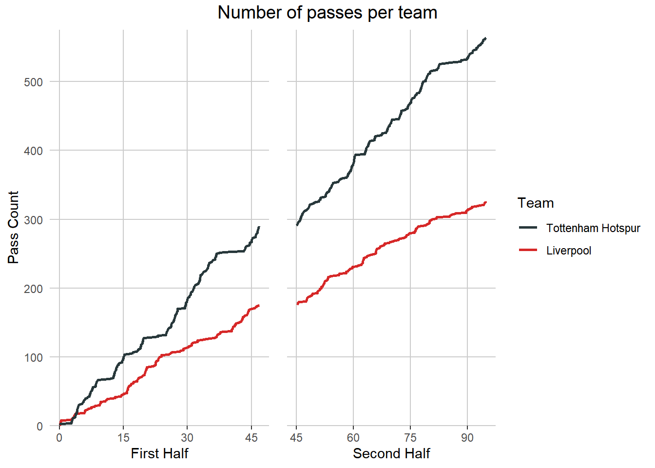
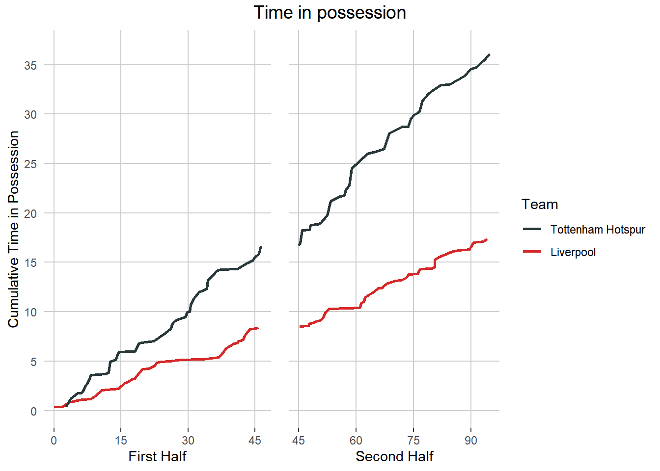
On TV, post-game soccer possession statistics are measured by the number of passess for each team during the game. In this post I explore possession using the freely available Statsbomb event level data from the 2019 Champions League final between Liverpool and Tottenham Hotspur. I thought it would be interesting to measure possession in two different ways: 1) simply count the number of passes each team makes, as they do on TV, and 2) use the event level data to cumulate the time for each event for both teams.
Firstly, I load the required libraries and the data I need, along with setting a few variables.
# Load required libraries
library(tidyverse)
library(gridExtra)
library(grid)
The StatsBomb data I use has already been processed to a certain extent. I pull the required CSV files from my GitHub repo. Please see this post which outlines how I originally pulled the StatsBomb data using the ‘StatsBombR’ package.
# This dataset contains event level data for the Liverpool v Spurs 2019 Champions
# League final
# 3,165 observations covering all the events that happened in the game
# 157 features relating to passes, shots, goalkeepers, time measurement and much more
match_1_clean <- read_csv("https://raw.githubusercontent.com/buckleco/Portfolio_Data/main/Liv_v_Spurs_Event_Data.csv")

# Get the high level details about each match in the StatsBomb free dataset
matches <- read_csv("https://raw.githubusercontent.com/buckleco/Portfolio_Data/main/matches.csv")
Before getting into the data, I set some variables and flags. This makes it easier to reuse this code in the future for other games.
# Set the selected match from the list of available matches
selected_match <- 1

# Team Names
home_team <- matches[selected_match, ] %>% pull(home_team.home_team_name)
away_team <- matches[selected_match, ] %>% pull(away_team.away_team_name)

# Colours
home_team_colour <- "#28383b" # Navy Blue
away_team_colour <- "#D62828" # Red
gridline_colour <- "#CCCCCC" # Light Grey
The purpose of this post is to create two line charts, one for each way of measuring possession. In order to do that, I need to create two different datasets, one containing only the passing data and the other one containing the event and time data. Firstly, I look at the number of passes per team.
1. Plot the number of passes per team
Manipulating the Data
Taking the event level data I loaded earlier, I filter it for pass events only and then count the number of passes per team. The final chart will be split into the first and second halves, so I also split the dataset into two parts.
# Pull the pass events from the base dataset
pass_poss_tib <- match_1_clean %>%
  filter(type.name == "Pass") %>%
  select(ElapsedTime, team.name, type.name, pass.outcome.name, period) %>%
  group_by(team.name) %>%
  mutate(pass_count = row_number(team.name)) %>%
  select(-pass.outcome.name) %>%
  ungroup()

# Set dataset for first half
pass_poss_tib_1 <- pass_poss_tib %>%
  filter(period == 1)

# Extract the adjustment amount to reset the start time
# for the second half to 2,700 seconds (45min)
adj_amt_2 <- pass_poss_tib %>%
  filter(period == 2) %>%
  filter(team.name == "Tottenham Hotspur") %>%
  filter(pass_count == 291) %>%
  pull(ElapsedTime) - (45 * 60)

# Set data for second half
pass_poss_tib_2 <- pass_poss_tib %>%
  filter(period == 2) %>%
  mutate(ElapsedTime = (ElapsedTime - adj_amt_2))
Creating the chart
The chart consists of two ggplot2 charts displayed together using the gridExtra package. Firstly, I create the two ggplot2 charts, one for each half. I reformat the x-axis, so it displays in minutes and I scale the y-axis, so that it is scaled for both halves and is only displayed in the first chart, which will be on the left of the final plot. I only keep the legend in the second plot.
# Create the left hand side of the chart
# Plotting the count of passes per team in the first half
pass_poss_plot_1 <- pass_poss_tib_1 %>%
  ggplot(aes(x = ElapsedTime)) +
  geom_line(aes(y = pass_count, colour = team.name), size = 1) +
  scale_color_manual(values = setNames(
    c(home_team_colour, away_team_colour),
    c(home_team, away_team)
  )) +
  scale_x_time(
    breaks = c(0, (15 * 60), (30 * 60), (45 * 60)),
    labels = c(0, (15), (30), (45)),
    limits = c(0, max(pass_poss_tib_1$ElapsedTime))
  ) +
  scale_y_continuous(expand = c(0, 0), limits = c(0, 575)) +
  theme(
    legend.position = "none",
    axis.ticks.y = element_blank(),
    panel.grid.major = element_blank(),
    panel.grid.major.x = element_line(color = gridline_colour),
    panel.grid.major.y = element_line(color = gridline_colour),
    panel.grid.minor = element_blank(),
    panel.background = element_blank()
  ) +
  labs(x = "First Half", y = "Pass Count")

# Create the right hand side of the chart
# Plotting the count of passes per team in the second half
# This part of the plot also includes the legend
pass_poss_plot_2 <- pass_poss_tib_2 %>%
  ggplot(aes(x = ElapsedTime)) +
  geom_line(aes(y = pass_count, colour = team.name), size = 1) +
  scale_color_manual(values = setNames(
    c(home_team_colour, away_team_colour),
    c(home_team, away_team)
  )) +
  scale_x_time(
    breaks = c((45 * 60), (60 * 60), (75 * 60), (90 * 60)),
    labels = c((45), (60), (75), (90)),
    limits = c(
      min(pass_poss_tib_2$ElapsedTime),
      max(pass_poss_tib_2$ElapsedTime)
    )
  ) +
  scale_y_continuous(expand = c(0, 0), limits = c(0, 575)) +
  theme(
    legend.key = element_rect(fill = "white"), # background of legend icon
    axis.title.y = element_blank(),
    axis.text.y = element_blank(),
    axis.ticks.y = element_blank(),
    panel.grid.major = element_blank(),
    panel.grid.major.x = element_line(color = gridline_colour),
    panel.grid.major.y = element_line(color = gridline_colour),
    panel.grid.minor = element_blank(),
    panel.background = element_blank()
  ) +
  labs(x = "Second Half", colour = "Team")
I now have two charts that need to be combined into one final chart:
- pass_poss_plot_1 (first half chart)
- pass_poss_plot_2 (second half chart)
# Using the gridExtra package arrange the two plots into one chart
grid.arrange(pass_poss_plot_1, pass_poss_plot_2,
  ncol = 2, widths = c(3.8, 5.2), # c(3.5,3,1),
  top = textGrob("Number of passes per team", gp = gpar(fontsize = 14))
)
2. Plot the amount of time in possession per team
Manipulating the Data
In the second part of this post I create the datasets containing the cumulative amount of time across all the events for each team. Again, taking the event level data, I calculate the start and end time of each possession and I delete all the events for each possession except the first and last events. I also delete possessions that are zero seconds long. I then calculate the cumulative time in possession for each team. As the final chart will again be split into two halves, I do the same with the data.
# Calculate the cumulative time in possession for each team
# A given possession can be made up of many events
# I am only interested in the time of the first and last events of each possession
poss_tib <- match_1_clean %>%
  select(
    index, timestamp, minute, second, period, possession, possession_team.id,
    possession_team.name, duration, type.name, play_pattern.name,
    ElapsedTime, StartOfPossession, TimeInPoss, TimeToPossEnd
  ) %>%
  mutate(EventFlag = case_when(
    TimeInPoss == 0 ~ "StartTime",
    TimeToPossEnd == 0 ~ "EndTime",
    TRUE ~ "Event"
  )) %>% # distinguish between first, last
  # and middle events for a given possession
  select(
    possession, possession_team.name, EventFlag,
    ElapsedTime, TimeInPoss, TimeToPossEnd, period
  ) %>%
  filter(!EventFlag == "Event") %>% # remove the non first or last events
  mutate(TimeDiff = (TimeInPoss - TimeToPossEnd)) %>%
  filter(!TimeDiff == 0) %>% # remove the possessions that are zero seconds long
  group_by(possession, possession_team.name, EventFlag, ElapsedTime, period) %>%
  count() %>% # this puts mutiple entries with the same ElapsedTime on the sane row
  ungroup() %>%
  select(!n) %>% # remove the count
  arrange(ElapsedTime) %>% # make sure it is ordered correctly
  pivot_wider(
    names_from = EventFlag,
    values_from = ElapsedTime
  ) %>% # StartTime and EndTime as columns
  filter(!is.na(StartTime)) %>% # remove the NA; first row of 2nd half
  mutate(PossTime = EndTime - StartTime) %>%
  group_by((possession_team.name)) %>%
  mutate(CumTime = cumsum(PossTime)) %>%
  ungroup() %>%
  select(StartTime, CumTime, possession_team.name, period)

# Extract the adjustment amount to reset the start time
# for the second half to 2,700 seconds (45min)
adj_amt <- poss_tib %>%
  filter(period == 2) %>%
  filter(CumTime == 1002.514) %>% # first row of the 2nd half
  pull(StartTime) - (45 * 60)

# Split the data out for the first half into a mini dataset
time_poss_tib_1 <- poss_tib %>%
  filter(period == 1) # keep the first half only

# Split the data out for the second half into a mini dataset
# Adjust the start time of the seconf half back to 45mins (2,700 seconds)
time_poss_tib_2 <- poss_tib %>%
  filter(period == 2) %>% # keep the second half only
  mutate(StartTime = (StartTime - adj_amt)) # %>% # adjust the StartTime
# so it starts at 2,700 seconds
Creating the chart
To create the time based possession chart, I follow a very similar process to the one I used for the pass possession chart above. Additionally, I format the y-axis to be displayed in minutes rather than seconds.
# Create the left hand side of the chart
# Plotting the amount of time in possession per team in the first half
time_poss_plot_1 <- time_poss_tib_1 %>%
  ggplot(aes(x = StartTime)) +
  geom_line(aes(y = CumTime, colour = possession_team.name), size = 1) +
  scale_color_manual(values = setNames(
    c(home_team_colour, away_team_colour),
    c(home_team, away_team)
  )) +
  scale_x_time(
    breaks = c(0, (15 * 60), (30 * 60), (45 * 60)),
    labels = c(0, (15), (30), (45)),
    limits = c(
      min(time_poss_tib_1$StartTime),
      max(time_poss_tib_1$StartTime)
    )
  ) +
  scale_y_time(
    breaks = c(
      0, (5 * 60), (10 * 60), (15 * 60), (20 * 60),
      (25 * 60), (30 * 60), (35 * 60), (40 * 60)
    ),
    labels = c(0, (5), (10), (15), (20), (25), (30), (35), (40)),
    limits = c(0, 2200)
  ) +
  theme(
    legend.position = "none",
    axis.ticks.y = element_blank(),
    panel.grid.major = element_blank(),
    panel.grid.major.x = element_line(color = gridline_colour),
    panel.grid.major.y = element_line(color = gridline_colour),
    panel.grid.minor = element_blank(),
    panel.background = element_blank()
  ) +
  labs(x = "First Half", y = "Cumulative Time in Possession")

# Create the right hand side of the chart
# Plotting the amount of time in possession per team in the second half
# This part of the plot also includes the legend
time_poss_plot_2 <- time_poss_tib_2 %>%
  ggplot(aes(x = StartTime)) +
  geom_line(aes(y = CumTime, colour = possession_team.name), size = 1) +
  scale_color_manual(values = setNames(
    c(home_team_colour, away_team_colour),
    c(home_team, away_team)
  )) +
  scale_x_time(
    breaks = c((45 * 60), (60 * 60), (75 * 60), (90 * 60)),
    labels = c((45), (60), (75), (90)),
    limits = c(
      min(time_poss_tib_2$StartTime),
      max(time_poss_tib_2$StartTime)
    )
  ) +
  scale_y_time(
    breaks = c(
      0, (5 * 60), (10 * 60), (15 * 60), (20 * 60),
      (25 * 60), (30 * 60), (35 * 60), (40 * 60)
    ),
    labels = c(0, (5), (10), (15), (20), (25), (30), (35), (40)),
    limits = c(0, 2200)
  ) +
  theme(
    legend.key = element_rect(fill = "white"),
    axis.title.y = element_blank(),
    axis.text.y = element_blank(),
    axis.ticks.y = element_blank(),
    panel.grid.major = element_blank(),
    panel.grid.major.x = element_line(color = gridline_colour),
    panel.grid.major.y = element_line(color = gridline_colour),
    panel.grid.minor = element_blank(),
    panel.background = element_blank()
  ) +
  labs(x = "Second Half", colour = "Team")
I now have two charts that need to be combined into one final chart:
- time_poss_plot_1 (first half chart)
- time_poss_plot_2 (second half chart)
# Using the gridExtra package arrange all the plots into one plot
grid.arrange(time_poss_plot_1, time_poss_plot_2,
  ncol = 2, widths = c(3.8, 5.2), # c(3.5,3,1),
  top = textGrob("Time in possession", gp = gpar(fontsize = 14))
)
As expected both charts follow a similar pattern. For possession measured by number of passes, Spurs finished with 564 passes (63%) and Liverpool had a total of 326 passes (37%). Whereas, for cumulative time in possession of the ball the final breakdown is Spurs with 36m 05s in possession of the ball (68%) and Liverpool with 17m 22s (32%).