Analysis of Barcelona possession
The freely available Statsbomb event level soccer data includes 520 Barcelona La Liga games during the period from 2004 to 2021. Barcelona are famous for their ability to out-possess nearly every team they play against, so I thought it would be interesting to dig into the data and produce a few charts to demonstrate Barcelona’s possession dominance.
Firstly, I load the required libraries for this analysis.
# Load libraries required for this post
# library(StatsBombR)
library(tidyverse)
library(gridExtra)
library(grid)
library(scales)
Next, I set the color variables for the plots.
# Set the colour variables for the plots
barca_team_colour <- "#FF832B" # orange
opp_team_colour <- "#9A114F" # magenta 70
non_event_colour <- "#BBBBBB" # grey
The StatsBomb data that I use has already been processed to a certain extent. I load the required CSV files from my GitHub repo. Please see this post, which outlines how I originally pulled the StatsBomb data using the ‘StatsBombR’ package.
# get the base data containing possession times for each of the 520 Barcelona games
# 7 variables with 1,560 observations
plotData520_tib <- read_csv("https://raw.githubusercontent.com/buckleco/Portfolio_Data/main/Barcelona_Possession_Data.csv")

# Get the high level details about each match
# 42 variables with 520 observations
matches_ll <- read_csv("https://raw.githubusercontent.com/buckleco/Portfolio_Data/main/Barcelona_Matches.csv")
Even though the data is in good shape, I still need to do some further processing, such as changing variable types, creating new variables and reordering the data.
# Sort the data, so that it is Barcelona, Non Event and Opposition
plotData520_tib <- plotData520_tib %>%
  mutate(across(game_id, as.integer)) %>% # change from char to int
  mutate(event_owner = case_when(
    possession_team.name == "Barcelona" ~ "Barcelona",
    possession_team.name == "NonEvent" ~ "Ball not in play",
    TRUE ~ "Opposition"
  )) %>%
  arrange(game_id, event_owner) %>%
  mutate(across(game_id, as.factor)) %>% # change from int to factor
  mutate(across(event_owner, as.factor)) %>% # change from char to factor
  mutate(game_id = fct_rev(game_id)) %>%
  mutate(event_owner = fct_relevel(event_owner, "Barcelona", "Opposition", "Ball not in play"))
I create a modified dataset to include the percentage of time per game each team is in possession. Also, I account for the percentage of time when the ball is not in play. For a given game, the sum of the possession for each team plus the percent of time the ball is out of play equals 100%.
# Modify the dataset to include the percentage of time in possession
plotData520_tib_1 <- plotData520_tib %>%
  group_by(game_id) %>%
  summarise(
    perc_poss_time = (tot_poss_time / sum(tot_poss_time)),
    tot_poss_time = tot_poss_time,
    num_poss_count = num_poss_count,
    event_owner = event_owner,
    poss_team_name = possession_team.name
  ) %>%
  ungroup() # %>%
I use this data to create a boxplot chart to examine how much possession Barcelona have in their games compared to the possession of their opponents. I also include the pecentage of time the ball is not in play per game.
# Boxplot chart using average per game possession time
plot520_box <- ggplot(plotData520_tib_1, aes(event_owner, perc_poss_time)) +
  geom_boxplot(aes(fill = event_owner)) +
  scale_fill_manual(values = c(barca_team_colour, opp_team_colour, non_event_colour)) +
  scale_y_continuous(labels = scales::percent_format(accuracy = 1)) +
  theme(
    legend.key = element_rect(fill = "white"), # background of legend icon
  ) +
  labs(
    title = "Barcelona Possession vs Opposition",
    x = "Possession Team", y = "Time in Possession (%)", fill = ""
  )
plot520_box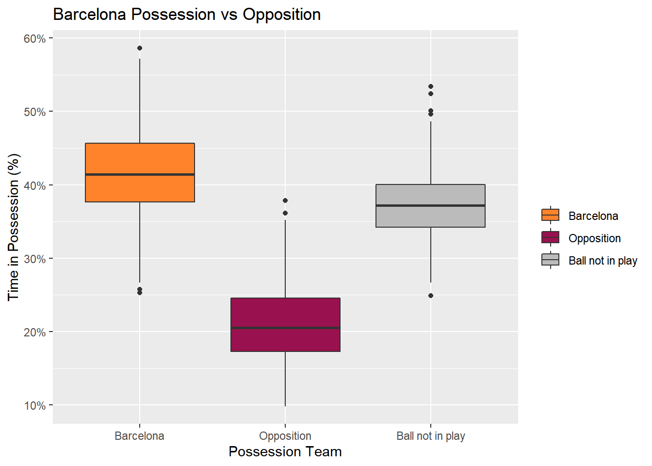
Barcelona dominate their opponents when it comes to time in possession, with the lowest outlier of possession for Barcelona above the 75th percentile (the top of the box) of possession for the opponent.
I use the same data to create a scatterplot chart, which again uses the percentage of time in possession per game, but, additionally, I plot it against the count of possessions in a game.
# Scatterplot chart using average per game possession time
plot520_scat <- ggplot(plotData520_tib_1, aes(perc_poss_time, num_poss_count)) +
  geom_point(aes(col = event_owner)) +
  scale_colour_manual(values = c(barca_team_colour, opp_team_colour, non_event_colour)) +
  scale_x_continuous(labels = scales::percent_format(accuracy = 1)) +
  theme(
    legend.key = element_rect(fill = "white"), # background of legend icon
  ) +
  labs(
    title = "Barcelona Possession vs Opposition",
    x = "Time in Possession (%)", y = "Number of Possessions", color = "Possession Team"
  )
plot520_scat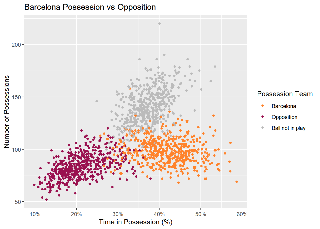
A very clear pattern can be seen, where Barcelona have more possesion than their opponents and regularly have more possessions too. This makes sense: the greater amount of individual possessions in a game, generally the greater total possesion overall. This chart interestingly demonstrates that the number of times the ball goes out of play is noticeably greater than the number of possessions for a given team. Although, these tend to be shorter in duration than an individual possession for a given team, and for Barcelona in particular.
The next thing I look at is how Barcelona stack up against specific opponents. In order to do this I need to create an updated dataset. Firstly, I pull the names of all the opponents from my original dataset. Then, using the dataset from the charts above and this list of opponents, I create a dataset that ultimately contains three rows for each opponent detailing the average possession time for that team, Barcelona and the average time the ball was not in play.
# Refine dataset for dot plot by specific opponents
# First, make opposition table per game id
plotData520_tib_3 <- plotData520_tib %>%
  filter(event_owner == "Opposition") %>%
  select(game_id, possession_team.name)

# Opponents, avg possession vs that specific opponent
# and the event owner flag with 3 states: Barcelona, non event, Opponent
plotData520_tib_4 <- plotData520_tib_1 %>%
  left_join(plotData520_tib_3) %>% # add the opposition team names
  rename(opp_team_name = possession_team.name) %>%
  group_by(opp_team_name, event_owner) %>%
  summarise(avg_poss_time = mean(perc_poss_time)) %>%
  ungroup() %>%
  mutate(opp_team_name = as_factor(opp_team_name))
An appropriate type of chart to display this data is a dot plot. However, I ‘flip’ the chart so that it displays vertically. By doing this, I put the opponent team names on the y-axis, which makes the chart much easier to read. Also, the chart is ordered by Barcelona average possession, starting with the most at the top.
# Dot plot charting Opp avg poss vs Barca avg poss per opp team
plot520_dot_opp <- ggplot(
  plotData520_tib_4,
  aes(
    x = fct_reorder2(opp_team_name,
      rev(event_owner),
      avg_poss_time,
      .desc = FALSE
    ),
    y = avg_poss_time
  )
) +
  geom_point(aes(col = event_owner), size = 3) + # Draw points
  geom_segment(aes(
    x = opp_team_name, xend = opp_team_name,
    y = min(avg_poss_time - 0.05), yend = max(avg_poss_time + 0.025)
  ),
  linetype = "dashed", size = 0.1
  ) + # Draw dashed lines
  scale_colour_manual(values = c(barca_team_colour, opp_team_colour, non_event_colour)) +
  scale_y_continuous(
    labels = scales::percent_format(accuracy = 1),
    expand = c(0, 0)
  ) +
  theme(
    legend.key = element_rect(fill = "white"), # background of legend icon
    panel.grid.major = element_blank(),
    panel.grid.major.x = element_line(color = non_event_colour),
    panel.grid.minor = element_blank(),
    panel.background = element_blank()
  ) +
  labs(
    title = "Barcelona average possession vs La Liga opponent",
    x = "Opponents", y = "Average Possession (%)", color = ""
  ) +
  coord_flip()
plot520_dot_opp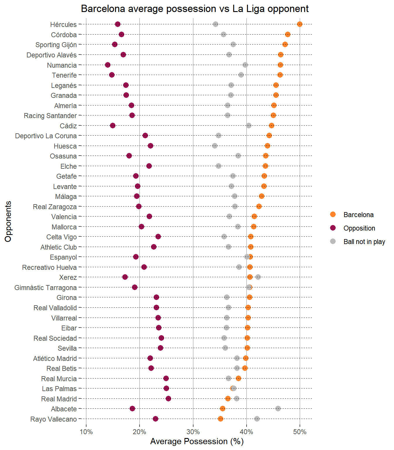
It can easily be seen that Barcelona out-possess all of their La Liga rivals. When Barcelona have less possession, it is due to the ball being out of play for longer, rather than their opponents having more of the ball. Perhaps unsurprisingly, Real Madrid are the opponent who average the most possession against Barcelona.
The next thing I am interested in is how possession changes through time. Therefore, using my base dataset, I construct a tibble for this purpose, by adding in features to identify the match date, season id and season name. Then I aggregate the possession percentages for each season.
# Refine dataset for dot plot by season, for all 520 games (i.e. not aggregated avg)
plotData520_tib_5 <- plotData520_tib %>%
  left_join(matches_ll %>%
    select(match_id, match_date, season.season_id, season.season_name)) %>%
  group_by(game_id) %>%
  summarise(
    perc_poss_time = (tot_poss_time / sum(tot_poss_time)),
    avg_poss_time = avg_poss_time,
    tot_poss_time = tot_poss_time,
    num_poss_count = num_poss_count,
    event_owner = event_owner,
    poss_team_name = possession_team.name,
    season_id = season.season_id,
    season_name = season.season_name
  ) %>%
  ungroup() %>%
  mutate(season_id = fct_reorder(as_factor(season_id), season_id, .desc = FALSE))

# Using the plotData520_tib_5 dataset, reduce it down to averages per season,
# i.e. aggregated, not all games displayed
# Note, I do this step separately as I need v5 later on
plotData520_tib_6 <- plotData520_tib_5 %>%
  group_by(season_id, season_name, event_owner) %>%
  summarise(avg_poss_time = mean(perc_poss_time)) %>%
  ungroup()
Again, a dot plot is a good choice for what I want to show here.
# Dot plot charting season avg poss for Barca avg poss per opp team
plot520_dot_season <- ggplot(
  plotData520_tib_6,
  aes(
    x = season_name,
    y = avg_poss_time
  )
) +
  geom_point(aes(col = event_owner), size = 3) + # Draw points
  geom_segment(aes(
    x = season_name, xend = season_name,
    y = min(avg_poss_time - 0.05), yend = max(avg_poss_time + 0.05)
  ),
  linetype = "dashed", size = 0.1
  ) + # Draw dashed lines
  scale_colour_manual(values = c(barca_team_colour, opp_team_colour, non_event_colour)) +
  scale_y_continuous(
    labels = scales::percent_format(accuracy = 1),
    expand = c(0, 0)
  ) +
  theme(
    legend.key = element_rect(fill = "white"), # background of legend icon
    panel.grid.major = element_blank(),
    panel.grid.major.x = element_line(color = non_event_colour),
    panel.grid.minor = element_blank(),
    panel.background = element_blank()
  ) +
  labs(
    title = "Barcelona average possession vs opponents, per season",
    x = "Season", y = "Average Possession (%)", color = ""
  ) +
  coord_flip()
plot520_dot_season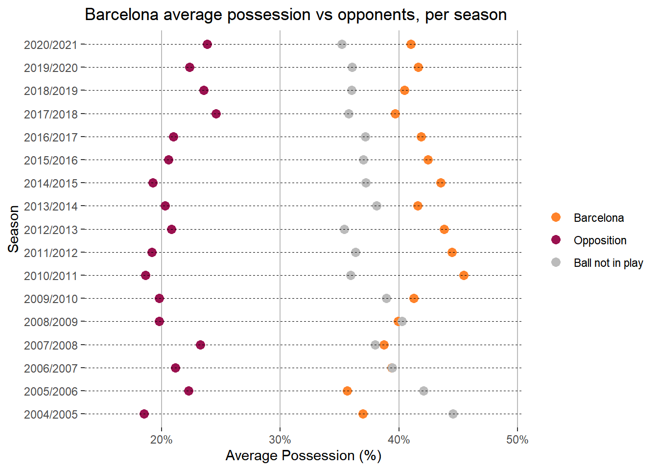
Looking at the average game possession for Barcelona across all the seasons available in the dataset (2004 to 2021), the 2010/2011 season stands out as a peak. This season was a very successful one for Barcelona, when they won La Liga and the Champions League. The coach Pep Guardiola left in 2012 and the average possession numbers declined in the following years.
The final thing I want to look at is the average time Barcelona keep the ball, during a possession, compared to their opponents. I create a quick tibble to do this, grouping the data by season and taking the average time of each possession.
# Using the plotData520_tib_5 dataset get the avg time per possession
plotData520_tib_7 <- plotData520_tib_5 %>%
  group_by(season_id, season_name, event_owner) %>%
  summarise(avg_poss_time = mean(avg_poss_time)) %>%
  ungroup()
Again, a dot plot is useful to display this data.
# Dot plot charting season avg time per possession
plot520_dot_poss_time <- ggplot(
  plotData520_tib_7,
  aes(
    x = season_name,
    y = avg_poss_time
  )
) +
  geom_point(aes(col = event_owner), size = 3) + # Draw points
  geom_segment(aes(
    x = season_name, xend = season_name,
    y = min(avg_poss_time - 1), yend = max(avg_poss_time + 1)
  ),
  linetype = "dashed", size = 0.1
  ) + # Draw dashed lines
  scale_colour_manual(values = c(barca_team_colour, opp_team_colour, non_event_colour)) +
  scale_y_continuous(expand = c(0, 0)) +
  theme(
    legend.key = element_rect(fill = "white"), # background of legend icon
    panel.grid.major = element_blank(),
    panel.grid.major.x = element_line(color = non_event_colour),
    panel.grid.minor = element_blank(),
    panel.background = element_blank()
  ) +
  labs(
    title = "Barcelona average time in possession vs opponents, per season",
    x = "Season", y = "Average Time in Possession (seconds)", color = ""
  ) +
  coord_flip()
plot520_dot_poss_time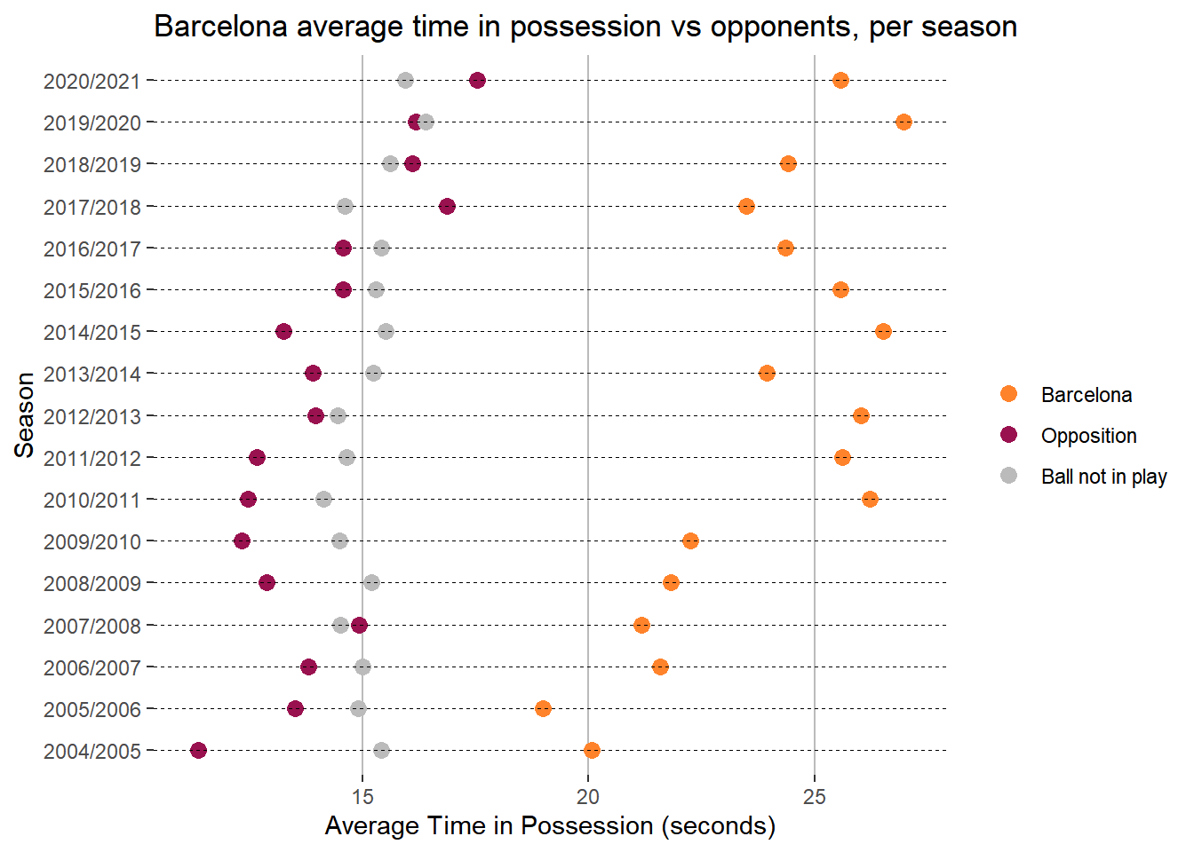
There is a noticeable improvement over time in how long Barcelona keep the ball for each possession, growing from about 20 seconds in 2004 to above 25 seconds in 2021. Their La Liga opponents also demonstrate an improvement in how long they keep possession, albeit to a lesser extent. The average duration each time the ball goes out of play, is reasonably steady around the 15 second mark.
I enjoyed digging around the Barcelona possession data. While I expected Barcelona to be stronger than their opponents when it came to possession, I thought it was quite interesting to see how utterly dominant they actually were during this period. They are a level above everyone else in La Liga when it comes to keeping the ball.