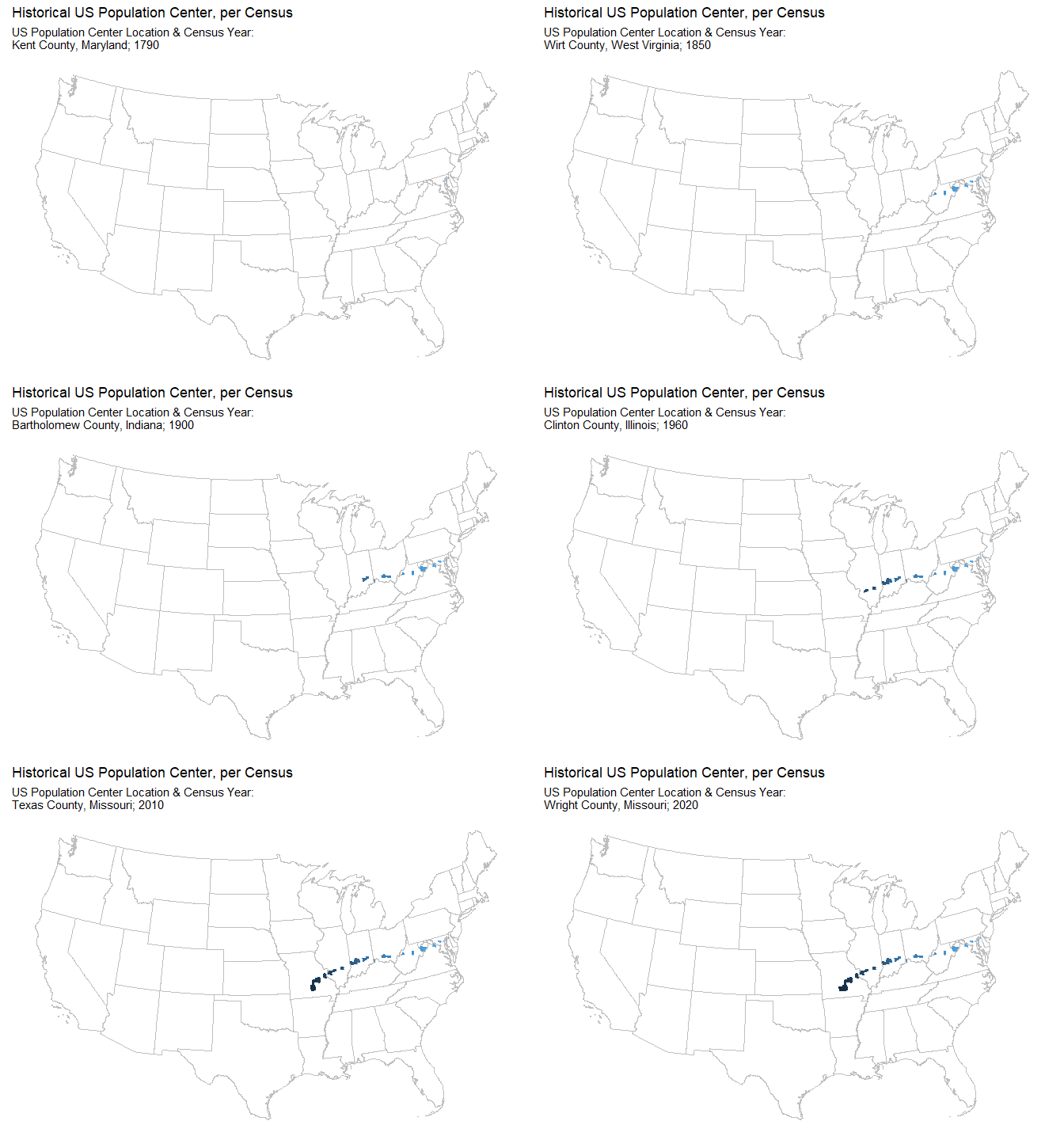
Animated map of historical US population center
While looking through the census data website I found an interesting measure that the Census Bureau has been tracking since 1790. Based on the results of each 10 year census, they track the county that is the population ‘center’ of the United States. Quoting the Census Bureau website, they define the mean center of the population “as the place where an imaginary, flat, weightless and rigid map of the United States would balance perfectly if all residents were of identical weight”.
Even though this is a notional concept, I thought it would be interesting to make an animated map of the US to visualize how the US population center has changed over time.
Firstly, I load the packages I need.
# Load libraries required for this post
# devtools::install_github("UrbanInstitute/urbnmapr")
library(urbnmapr)
library(tidyverse)
library(gganimate)
library(transformr)
Next, I prepare the data. I sourced the data for this post directly from the Census website. As it was such a small dataset, I manually copied it into a .csv file. I also manually added the ‘FIPS’ county identifiers to each row. These enable the dataset to be joined to the mapping data later on.
# Load the data
hist_US_center <- read_csv("hist_US_center.csv")

# Format the FIPS and Year variables
hist_US_center <- hist_US_center %>%
  mutate(
    FIPS = str_pad(as.character(FIPS), 5, pad = "0"),
    Year = as.integer(Year)
  )
The next step is to obtain the mapping data. I do this using the ‘urbnmapr’ package. Specifically, I pull both state and county level shape file data.
# Obtain state mapping data
# Remove Alaska and Hawaii (for asthetic purposes)
states_sf <- get_urbn_map(map = "states", sf = TRUE) %>%
  filter(!state_name %in% c("Alaska", "Hawaii"))

# Obtain county mapping data
counties_sf <- get_urbn_map(map = "counties", sf = TRUE)
Then, to create the final dataset, I join the county level dataset with the historical US population center dataset, and order it by year.
# Merge county map data with the historical US pop center data
# Order it cronologically by year; 1790 -> 2020
hist_map_data <- inner_join(counties_sf, hist_US_center,
  by = c("county_fips" = "FIPS")
) %>%
  arrange(Year)
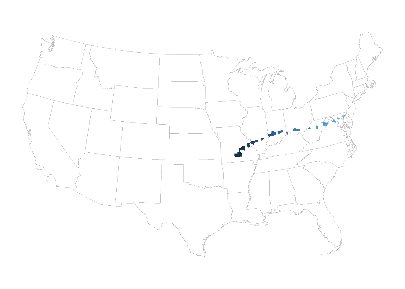
Now that the final dataset is ready, the next step is to create the map. Firstly, I create a straightforward continental US map, with the 48 states outlined. I then add the 24 counties that represent the US population center over time. Starting with the year 1790 in light blue, all the way to 2020 in dark blue.
# Use ggplot2 to create the map plot
map_plot <- hist_map_data %>%
  ggplot() +
  geom_sf(mapping = aes(fill = Year), color = NA, show.legend = FALSE) +
  geom_sf(data = states_sf, fill = NA, color = "grey", size = 0.05) +
  coord_sf(datum = NA) +
  scale_fill_continuous(high = "#132B43", low = "#56B1F7") +
  theme_bw() +
  theme(panel.border = element_blank())

map_plot
In order to create the animation, I build on the map created above using the ‘gganimate’ package. The two key functions I use are transition_time() and animate().
# Using the map plot created above using some functions from the
# gganimate package to create an animated map object
# Enter the details for the map subtitle that will change with each frame
map_anim <- map_plot + transition_time(Year) + shadow_mark(past = TRUE) +
  labs(
    title = "Historical US Population Center, per Census",
    subtitle = 'US Population Center Location & Census Year:
    {str_c(
      hist_US_center$`Center of Population`[which.min(abs(hist_US_center$Year-frame_time))],
      "; ",
      frame_time)
    }'
  )

# Animate the map
animate(map_anim, nframes = 29, fps = 1, end_pause = 5)
The animation gives a good idea of how the distribution of the US population has changed between 1790 and 2020. Up to 1940 the population center moved steadily westward. However, from 1950 onward it clearly changed to a southwest migration, most likely influenced by population increases in Texas and Florida.
I think gganimate is a great package that brings ggplot2 plots to life. I found it relatively intuitive to use and I didn’t need a lot of code to convert the static plot to an animated one. I can certainly see myself using this package again.