Voting map by Census Block Groups
2020 U.S. Presidential election: Cook County, Illinois
In this post I’m going to explore the tigris and leaflet packages to make some maps. I live in Cook County, Illinois, and I thought it would be interesting to create a relatively granular map of the county. After a little research, I found a detailed dataset containing projected votes for the 2020 U.S. Presidential election at the U.S. Census block group level.
To quote the Census Bureau, “Block Groups are statistical divisions of census tracts, are generally defined to contain between 600 and 3,000 people, and are used to present data and control block numbering”. This is exactly the type of detail I need to create maps with a high level of granularity.
Firstly, I load the packages I need. The tigris package contains the shapefiles for making the maps. A shapefile is a vector data storage format for storing the location, shape, and attributes of geographic features. The leaflet package has advanced mapping functionality.
# Load libraries required for this post
library(tidyverse)
library(tigris)
library(leaflet)Next, I load the locally stored data. I originally downloaded the .csv file from Harvard’s dataverse. The Voting and Election Science team on Harvard’s dataverse created a dataset where they compiled state 2020 U.S. Presidential election results and geographies. These were then projected onto U.S. Census block group geographies to form the final dataset. Votes are attributed based upon the proportion of the voting precinct’s area that intersects the corresponding block group.
# Load the data
# It contains voting projections at the Census Block group level
bg_voting_data <- read_csv("2021blockgroupvoting.csv")Beacuse the dataset contains the block group GEOID, it can be joined together with the corresponding shapefiles needed to create a map. In order to do this, I use the tigris R package, which has shapefiles at the block group level. I select only data for Cook county.
# Pull the block group shapefile data for Cook county
# Remove one block group that covers only the Lake Michigan part of Cook county
cook_bg <- block_groups(state = "IL", county = "Cook") %>%
filter(!GEOID == "170319900000") # remove area over Lake MichiganThe next step in the data preparation is to reduce the nationwide block group level voting dataset down to just Cook county and to add variables to determine the winning party (‘winner’) and the margin of victory (‘winning margin’).
# Using an inner join, join the cook county shapefiles to the voting data
# bg_voting_data - 233,866 block groups for the whole U.S.
# cook_bg - 4002 block groups for Cook county, IL
bg_voting_data_cook <- bg_voting_data %>%
inner_join(cook_bg, by = c("BLOCKGROUP_GEOID" = "GEOID"))
# Create a winner column populated with either REP or DEM
vote_res <- bg_voting_data_cook[, 1:4]
bg_voting_data_cook$winner <- colnames(vote_res)[max.col(vote_res, ties.method = "first")]
# Calculate the difference between the REP and DEM vote percentages,
# per block group
bg_voting_data_cook <- bg_voting_data_cook %>%
mutate(total_votes = select(., REP:OTH) %>%
rowSums(na.rm = TRUE)) %>%
mutate(rep_perc = (REP / total_votes) * 100) %>%
mutate(dem_perc = (DEM / total_votes) * 100) %>%
mutate(win_margin = dem_perc - rep_perc)
# Reduce the number of variables to keep only the ones I need
bg_voting_data_cook <- bg_voting_data_cook %>%
select("BLOCKGROUP_GEOID", "winner", "win_margin", "REP", "DEM")
# Create the final dataset by joining the voting data back to the
# Cook county shapefile dataset
cook_bg_2020 <- cook_bg %>%
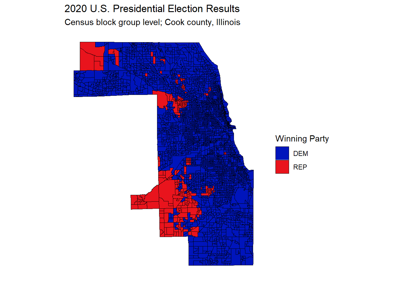
inner_join(bg_voting_data_cook, by = c("GEOID" = "BLOCKGROUP_GEOID")) # %>%I use ggplot2 to create the first map. It shows the block groups by winning party. Red for Republican and blue for Democrat.
# Create a ggplot to map the block group votes
gg_bg_2020 <- ggplot() +
geom_sf(
data = cook_bg_2020, aes(fill = winner),
color = "black", size = 0.1
) + # block groups
scale_fill_manual(values = c("#0015bc", "#e9141d")) +
theme(
axis.title.y = element_blank(),
axis.text.y = element_blank(),
axis.ticks.y = element_blank(),
axis.title.x = element_blank(),
axis.text.x = element_blank(),
axis.ticks.x = element_blank(),
panel.grid.major = element_blank(),
panel.grid.minor = element_blank(),
panel.background = element_blank()
) +
labs(
title = "2020 U.S. Presidential Election Results ",
subtitle = "Census block group level; Cook county, Illinois",
fill = "Winning Party"
)
gg_bg_2020
While the map above gives a good picture overall, clearly Democrats are more popular with Cook county voters than Republicans, it is difficult to obtain more specific information and fully benefit from the block group level detail.
Therefore, in order to leverage the detail in the dataset, it makes sense to use the leaflet R package to create a map overlaid with the block group level voting data. The two main benefits of doing this are:
- the ability to zoom into a location of interest
- the ability to hover over the block groups to see the actual voting numbers
# Create a leaflet map overlaid with voting data at block group level
# Map the colorFactor colors to categorical variables
# These are the two colors for the overlay
pal <- colorFactor(
palette = c("#0015bc", "#e9141d"),
levels = c("DEM", "REP")
)
# Create the hover tooltip labels
labels <- sprintf(
"<strong>%s</strong><br/><strong>%s</strong> %s<br/><strong>%s</strong> %s",
"Result", "REP: ", round(cook_bg_2020$REP), "DEM: ", round(cook_bg_2020$DEM)
) %>% lapply(htmltools::HTML)
# Generate the map with the block group voting overlay
leaflet(cook_bg_2020) %>%
addTiles() %>%
addPolygons(
color = "black", weight = 1,
fillColor = ~ pal(winner),
fillOpacity = 0.3,
highlightOptions = highlightOptions(
weight = 3,
fillOpacity = 0.7
),
label = labels,
labelOptions = labelOptions(
style = list(
"font-weight" = "normal",
padding = "3px 8px"
),
textsize = "15px",
direction = "auto"
)
)
The interactive map above really allows the user to get a better understanding of the voting patterns in Cook county. I made the red and blue shading transparent, so that the user can see the map underneath. Being able to zoom in is very useful in order to see the specific area covered by each block group. However, one thing I noticed while using it, is that some of the block groups have only a narrow winning margin. As a consequence, using a simple red and blue split hides some of the nuance within the data.
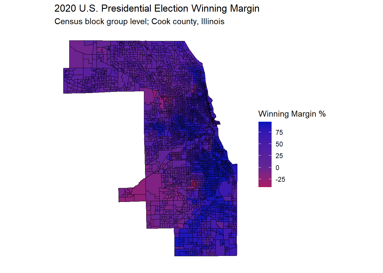
In order to overcome this issue, I can make another ggplot chart like the one above, except this time using the continuous variable, ‘winning_margin’, as the measure, rather than the categorical variable, ‘winner’. This allows for a diverging color gradient scale, with purple in the middle, and red and blue at the extremes.
gg_bg_2020_wg <- ggplot() +
geom_sf(
data = cook_bg_2020, aes(fill = win_margin),
color = "black", size = 0.1
) + # block groups
scale_fill_gradient2(
low = "#e9141d",
mid = scales::muted("purple"),
high = "#0015bc",
breaks = c(-25, 0, 25, 50, 75)
) +
theme(
axis.title.y = element_blank(),
axis.text.y = element_blank(),
axis.ticks.y = element_blank(),
axis.title.x = element_blank(),
axis.text.x = element_blank(),
axis.ticks.x = element_blank(),
panel.grid.major = element_blank(),
panel.grid.minor = element_blank(),
panel.background = element_blank()
) +
labs(
title = "2020 U.S. Presidential Election Winning Margin",
subtitle = "Census block group level; Cook county, Illinois",
fill = "Winning Margin %"
)
gg_bg_2020_wg
I feel this map gives a better sense of the Cook county voting picture. Some of the western block groups are slightly more Republican, but for the most part it is very much a county that votes Democrat, with no strong red block groups.
This was my first time using the tigris and leaflet packages. They are both very powerful. It was very easy to obtain the block group shapefiles using tigris functions. I know there is a lot more to explore in this package, with shapefiles at many different levels of granularity readily available. I’m looking forward to creating future posts where I do more mapping with R.